


Brand Identity: The Foundation Trust Is Built On
The first impression of a company forms within a split second of visual contact — not from reading a description, but from seeing a logo, colors, or a font on a sign or social media page. That first impression speaks about the brand before any text does. Brand identity is the system that makes this first impression manageable — instead of a random set of elements, the audience sees a deliberate, consistent visual language.
At ZOND Agency, we build identity as a cohesive system, not as separate elements added "just because" — so the brand looks equally strong on any medium, from a business card to an office sign.
What's Included in Identity Development
Logo. The brand's key graphic mark, which becomes the foundation of the entire visual system — developed with consideration for the business sector, audience, and long-term relevance.
Brand style. A set of rules and elements defining how the brand looks at every touchpoint — from documentation to advertising.
Visual concept. The overall idea and mood that unify all brand elements into a single whole — the company's visual "character," so to speak.
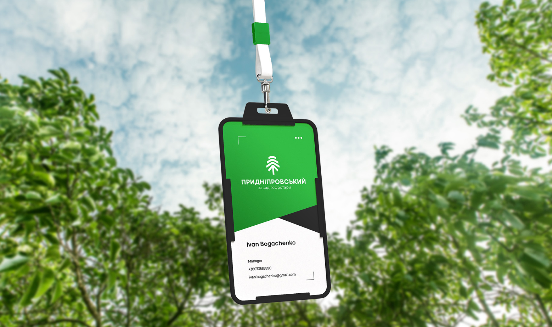
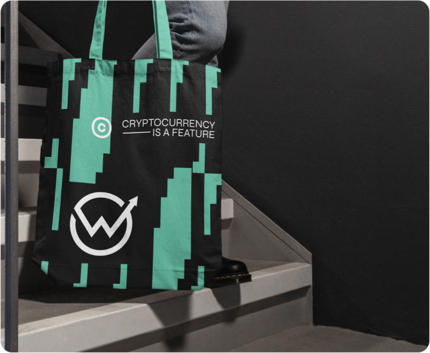
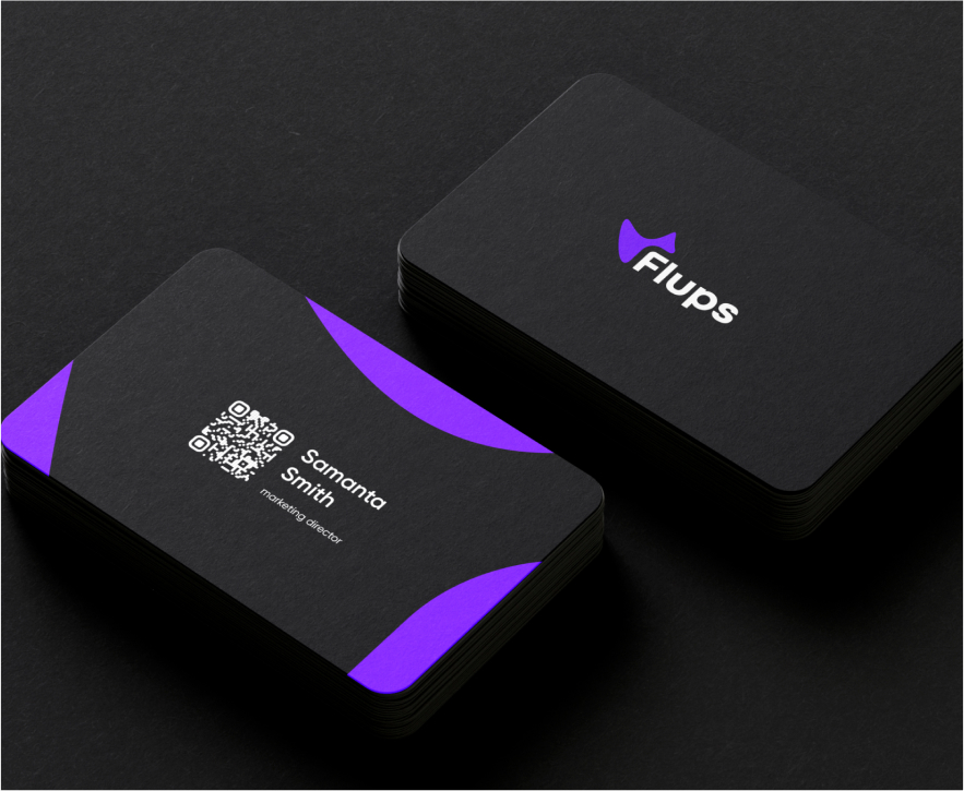
Media design. Adapting the identity to specific materials: business cards, letterheads, packaging, advertising layouts, and digital formats.
Brand palette and typography. Precisely defined colors with technical codes and a selected font pairing, used consistently across all brand materials.
Why a Business Needs Systematic Identity
Without a clear visual system, a brand risks looking inconsistent: one shade of color on the website, another on packaging, a third font on social media. Each of these details seems minor on its own, but together they prevent the audience from forming a cohesive, trustworthy image of the company. A well-thought-out identity solves this systematically, ensuring:
- a distinctive, recognizable image among competitors;
- a unified visual language across every touchpoint with the audience;
- the brand's ability to stay relevant and set an example for the market;
- faster decision-making from the audience through instant recognition.
How We Build the Process
1. Business immersion. We study the company's specifics, target audience, and competitive environment to understand the context the future identity will operate in.
2. Concept formation. Based on the research, we define the core idea and mood that will form the foundation of the brand's visual system.
3. Logo and core elements development. We create the mark, color palette, and font system, aligned around a single concept.
4. Media adaptation. We test and adapt the identity on real materials — from digital formats to print production.
5. Rules system formation. We define clear principles for using each element, so all future materials are created consistently.
How Identity Differs From a Simple Logo
A logo is just one element, while identity covers the entire system: how the brand sounds in text, which colors dominate, what mood the visual materials convey. A company that orders only a logo without building the full system often ends up with other materials created chaotically, without a unified logic — and the brand looks disjointed even with a strong mark leading it.
Why Trust Us With Your Identity Development
- The team fully immerses itself in your business specifics rather than working off a template;
- A comprehensive approach — from the logo to adaptation across every medium;
- Systematic solutions that work equally well at any scale of use;
- Partner collaboration with clear communication at every stage.
What You Get as a Result
- A developed logo and core brand style elements;
- An approved color palette and font system;
- Adapted layouts for key brand media;
- A cohesive visual language ready to scale to new materials and communication channels.
Example of our work — full brand development for Cha, a mental health tea club. A logo styled after a Chinese character and the image of a girl in traditional Eastern dress embodied the philosophy of calm and mental wellbeing behind the brand.
Ми максимально зануримося у вашу ідею.Наша команда має величезний досвід у створенні брендів різних напрямків та сфер.Давайте творити разом!Розробляємо:Неймінг.Візуальний стиль.Логотип.Торгова марка.


